POLELE
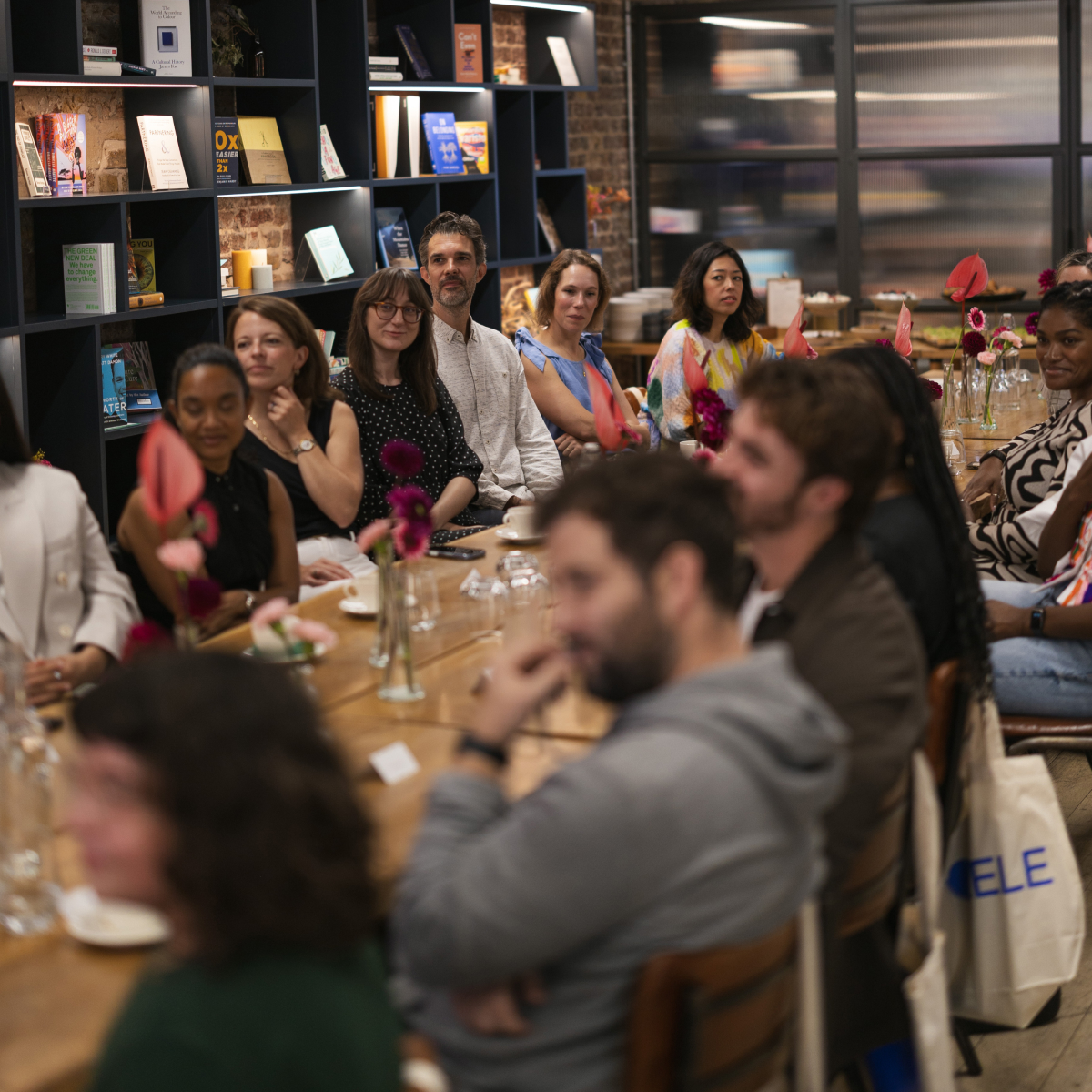
Last week I had the pleasure of sharing a very delicious breakfast with an inspiring group of changemakers across industries to celebrate the launch of POLELE, a new strategic communications agency founded by Viya Nsumbu.
I worked closely with Viya to create a Brand Identity that would stay true to its name and the individuality of its founder.
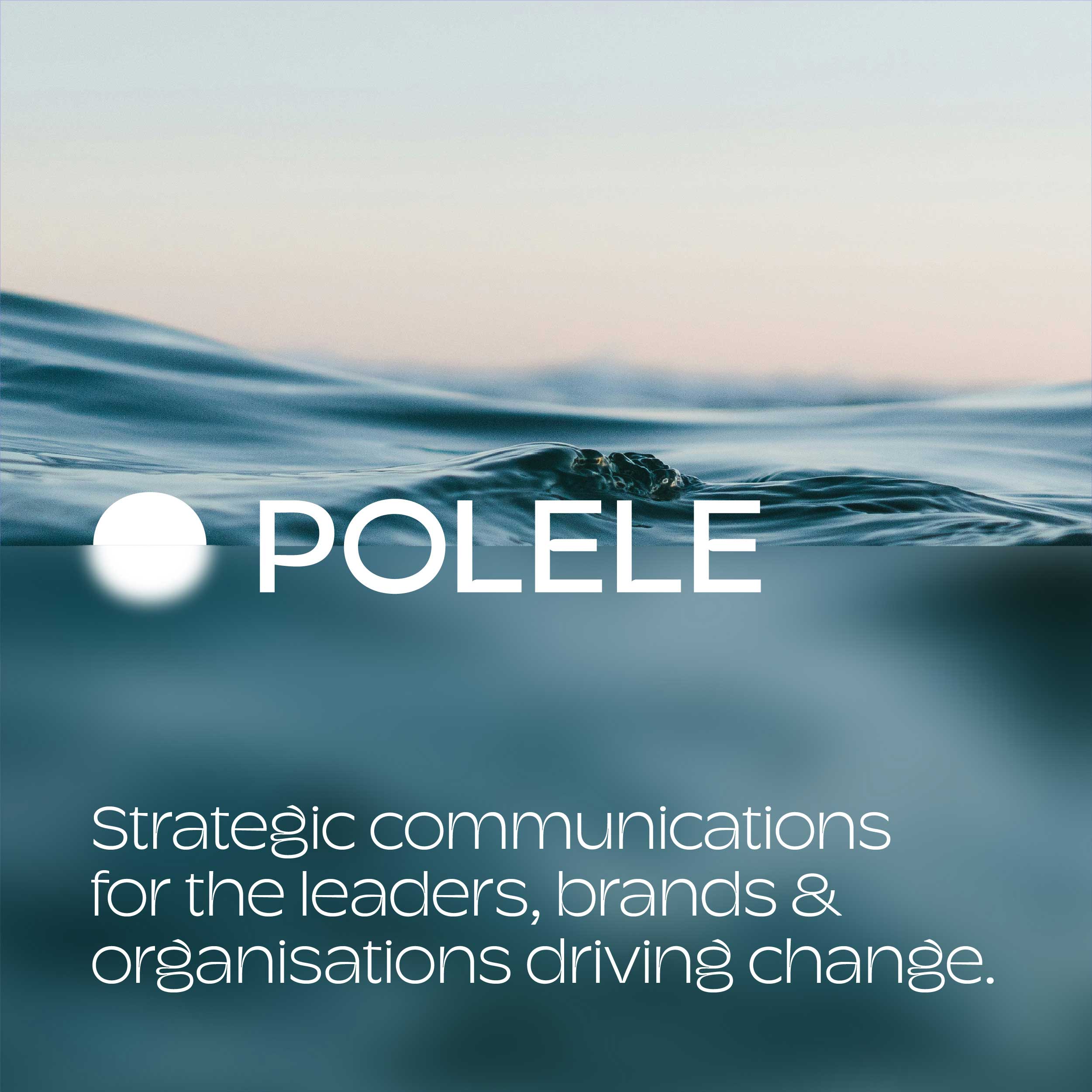
POLELE means clarity, clear and transparent in Lingala, one of the many languages spoken in the Democratic Republic of Congo. This reflects the essence of the work that Viya has been doing, formally and informally, over the past fifteen years. In an increasingly noisy world, clarity is rare. Yet it is the very thing leaders and organisations need most.
I brought the name to life using the concept of ‘Clarity on the Horizon’ which you can see woven through all of the outputs in the brand identity.
Viya also wanted a brand identity that could speak to varying sectors – some of which are quite corporate. While staying true to her bold, colourful and energetic self. By incorporating POLELE’s take on a Yves Klein blue alongside the typeface Champ by the very talented Typeverything I think I might have cracked it.
“Working with Pete on POLELE’s visual identity was a genuine pleasure. He delivered something far beyond what I could have imagined, capturing the perfect balance of professionalism and personality. Pete cared for my brand as deeply as I did, and that care is evident in every detail. His process was thoughtful, collaborative, and grounded in creativity. Equally important, his values aligned with what POLELE stands for. The final identity is distinctive, enduring, and will grow with my business.”
- Viya Nsumbu, Founder & Director, POLELE
– Brand Identity– Guidelines
– Print Production
– Merchandise
– Startup